Sunday, April 29, 2012

Objectification


In this project we were put in a group and was told to take an object and to make a performance piece on it. Our group decided for our object to be the identity. We want to do a piece on identity and how we put our identity like we put on make-up.  We felt like everyday people put on a character when they go out into the public.

We started by deciding to shoot a video of us putting on different identities than ourselves. We all choose extreme identities to portray. I choose a drag queen because a drag queen portrays a strong woman identity.  These men put on a character of what they feel like their enter woman would be like. So I portrayed a man portraying a strong woman. Sounds complicated doesn’t it? Well it’s hard to explain, I have always had a strong connection to gay men and I have a few friends who do drag so I have always been in that world. I feel intrigued how these men portray strong women and I think real women could take inspiration on how to be strong from drag queens. We as a group chose to do snapshots so it would have the effect of us moving. We shot over our shoulders and captured or face in a mirror. We felt like that would feel more personal, like you are standing over someones shoulder watching them.

I feel the video portrays the idea of normal people putting on extreme identities.  I feel Courtney shot the video and put it together beautifully. I feel like our group worked together to convey our idea of identity and it all came together perfectly.

De- Emphasis a What?


On this project we had to build a corner out of foam core and put a design on it to de-emphasis the corner. I always like to use organic shapes so I was inspired by ocean waves. I tried to capture the organic shape that waves make and how they break.  I wanted the shadows to look like waves in the negative space.

It took me a few tries to cut the shapes just right out of foam core, but eventually I got it the hang of it. Foam core is quite difficult to cut organic shapes with but once you get the hang of how of it then everything goes smoothly.

Sunday, March 25, 2012

They collect Sea Shells by the Sea Shore


For Wunderkammer project my concept was things we hoard as children but then as we grow up get rid of.  I mostly used old toys, sea shells, marbles, and jewelry.  I drew from my own child hood of thing I collected and have had a hard time getting rid of but now has turned into an art piece. 

I used driftwood in this piece because I have always found it beautiful and have always collected it. I used sea shells because I have always collect sea shells when I went to the beach so I used a lot of them plus it follows the concept of things children collect. I used the plate with the dog on it because it really interested me that someone would pay to have an actual picture of their dog on a plate and then get rid of it. So I wanted to use it to show how something personal can easily be thrown away.

All the toys used were toys from my childhood that I never wanted to get rid of. Like the little baby doll with one are, I did not want to get rid of it just because it was missing an arm.

Overall I feel like my piece conveyed things a child would collect. Maybe I was just one of those children that hoarded things that interested me and had emotional connections too. Even today it is hard for me to get rid of things that is connected to a memory but I am glad that some of the things I have hoarded from childhood is now been made into an art piece.


An abstract sculpture = a love story, but not the kind you think


For the Line Sculpture project I wanted to do an abstract sculpture that represented my nephew Aiden. I used old wood and scrap metal to construct the sculpture. I wrapped copper wire around the wood to represent how Aiden became a big part of our life and brought our family together. The drift wood branching out represents how new people came into our lives and became like family.

I planted clover around the bottom because we are Irish and Aiden’s name is Celtic for fire. Our Irish roots is very important to our family.  That is also why I used red wire because red represents fire. I attached a candle to represent his sprit that I feel is still with us. I also put a bird’s nest with blue wire shaped like an egg to represent the baby my sister is pregnant with and how they baby has given us hope and also help us deal with the passing of my nephew. I wanted to sculpture to represent the strength and love my nephew gave us.  Aiden taught me to be strong and unconditional love.

I feel like everything I wanted in this sculpture to represent was there. I love the way the wire and wood played off each other. I really liked the organic shaped that was made by the wire. The only let down was the clover withered from me digging it up and planting it but it was now grown back.


Lexie seems to be a fan....lol

Monday, February 27, 2012

My Creative Mind: Caught between Art and Design


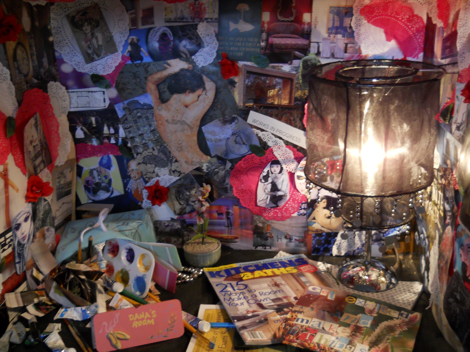
“Window to the soul,” is what this past project was called. It was for us to take something like a box and do a biographical design inside.  I wanted to show my creativity inside the box since that is a big part of my life.  While doing this I found I was mixed between showing art or interior design as things that inspire me. I have always been caught between art and interior design.  I love both and have always been pushed to choose between the two. I feel like just because I am an interior design major doesn’t mean I have to loss passion and love for art. I  fell like they can be brought together and work in harmony; which my box did.


So inside the box I used mixed media on the back ground, I used pictures of thing that I love and inspire me, red and white dollies, and red roses. All the pictures used were pictures of art, interiors, people, and thing in nature that inspires me. I used the dollies that were shaped like hearts to show things I love and the ripped dollies stand for thing I am no longer in love with but still in my heart.  I used roses and leaves to show how I grow and change and how beauty blossoms. I also put a bag that has fallen over at the bottom of my box that had art and interior design tools spilling out of it.  I had magazines that I like to read and also a UNA catalog to show how I love UNA and the department that I am in.

On the outside of my I rolled pages from old magazine because it represents ideas that grow inside my head. Plus it shows  another part of my life of how I am eco conches that I upcycled these old magazines and turned them into art. I also used a red colored scarf as a curtain on the front. I also think the red scarf is like an abstract view of “the curtain of my mind”

I am very proud of my box. I feel like it shows my concept of my creative mind. I like that every time you look at it you can see something you didn’t see the first time. I feel that my box shows how art and interior design can work together in harmony. I just love how everything works together to show my ideas; however many there may be.

A Story About a Dirty Q-tip


In this project we had to take something small, like something that would fit in your hand, and make it into something larger. So I picked a Q-tip because it was something small that everyone owns; plus it doesn’t hurt that I knew I would have the materials to make this since I recycle. I used a wrapping paper roll as the middle and empty water bottles as the ends.  I then used un-rolled cotton balls to make the cotton ends. I also used two different shades of blues that I had left over to make the blue of the middle.

A Q-tip would be kinda of boring to look at so I decided to do something different by using the idea of cleaning out your ears and losing your marble.  Losing you marbles is a metaphor for some going insane. I wanted the ends to look dirty along with this. I wanted it to appear like the ears have not been cleaned in a while. So I put marbles on the ends and melted yellow candles on top so it looked like ear wax. I accidently set the cotton balls on fire while melting the candles but it made a cool dirty affect so I then set spots on fire to continue that look.

I feel like my concept of someone cleaning out their ears and losing their marbles was accomplished. The Q-tip looked real and was to scale. I am very proud of how it turned out.

Sunday, January 29, 2012

Growth

I have named this piece “growth”.  When I first started this piece I had the idea of how things grow and change throughout life.  Life is constantly changing and can go in different directions then you thought. That is why I used a lot of different shapes and sizes in this piece.  I also wanted to add a touch of life in this piece by adding texture; I wanted to give it the feel of human skin. I want when people to look at it and see that is moving and growing into something grand. Like how us college students are going through changes and turning into the adults that we want to be.
I first started by making three small models with the idea of it looking like it is changing and growing. I then took elements from all three models that I like.  I feel like some of my smaller models was a little over done so I tried to stick with shapes that didn’t look like something exploded on it since that is not what I am going for.

I feel like my piece how turned out the way I wanted it to.