Sunday, April 29, 2012

Melted Beauty


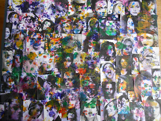
On pinetrest we have all seen the melted crayons on canvas.  Well this piece is me playing with melted crayons. I took tinny pictures of different woman of different ages/race and putting them onto canvas. I then shredded crayons on top of I, took plastic rap and put over it, and then took the hair dryer and melted the crayons.

I like how the melted wax reacted to the pictures, giving the woman a strange make-up affect.

Beauty Fades


Beauty Fades is a work in progress, I started drawing her after drawing 1 and I never have time to finish her. But the concept behinds her is an ageing woman. I made one side of her hair grey looking and I tried to make her body look wrinkled. I need to finish her cause I like how she is going so hopefully this summer I can finish her.

Yet again I couldn’t get the pictures to rotate so sorry.  

Butterfly instead of a Beetle


Last year during this time I had Western Literature. I had to read Kafka’s Metamorphosis, which if your ever lucky enough not to have to read it is about A man who has awaken to found he had turned into a beetle and the story follows hoe his life goes straight to crap from losing his job to his family rejecting him. He then dies from a broken heart after his father hits him with an orange because he left his room. Lovely story isn’t it? No it is horrible, I literally cried after having to read it. But to the point, after I read this story I could not get it out of my head. So during the summer I had the urge to draw something in response to this story. I later painted it with watercolors, in my painting it a woman not a man, she turns into a butterfly not a beetle, and is viewed as beautiful not ugly.

I guess you can say this is a way of me dealing with this story by changing it.  For some reason i can nor routa it.....sorry.
Another bedroom render


For this class assignment we had to find a picture of a bedroom. We then drew it several times and used different techniques on it. I did one in pen, color pencil, and grey scale.

Seting Area Rendering


For this project we were suppose to find either a setting area or dining area to then draw and hand render. I found a picture of a setting area that I then drew numerous times and used different techniques on. I did one in pen, color pencil, and grey scale.

Bedroom Hand Rendering


This was a class project to teach us how to hand render rooms. He gave us just the outline of a master bed room and told us to place furniture it. Then we were to render this room to get our ideas across. We tried different colors in the room. We also learned how to make light and shadows in a room. We used color pencils and marks.  We also used different types of paper.

The Cube from........


For this project we were asked to build a 6’ x 6’ x 6’ cube out of poster paper. We could use any color scheme for it so I choose analogous color scheme, which is when colors are adjacent to each other on the color wheel. I chose cool colors because they are peaceful and pleasing to the eye.  When it came to using principles and elements of design I thought of line first. I wanted to use line to bring your eye all around the cube and to all the emphasis areas. I made diagonals and triangles out of the lines. I created rhythm by repeating shapes and lines on the cube. I also created variety by every side of the cube being somewhat different than the other side.

I am not going to lie I hated building this cube, poster paper is not the easiest thing to build something out of. My craftsman ship is ruff but I feel like my basic concept is good and I also feel my color scheme is strong.

Objectification


In this project we were put in a group and was told to take an object and to make a performance piece on it. Our group decided for our object to be the identity. We want to do a piece on identity and how we put our identity like we put on make-up.  We felt like everyday people put on a character when they go out into the public.
We started by deciding to shoot a video of us putting on different identities than ourselves. We all choose extreme identities to portray. I choose a drag queen because a drag queen portrays a strong woman identity.  These men put on a character of what they feel like their enter woman would be like. So I portrayed a man portraying a strong woman. Sounds complicated doesn’t it? Well it’s hard to explain, I have always had a strong connection to gay men and I have a few friends who do drag so I have always been in that world. I feel intrigued how these men portray strong women and I think real women could take inspiration on how to be strong from drag queens. We as a group chose to do snapshots so it would have the effect of us moving. We shot over our shoulders and captured or face in a mirror. We felt like that would feel more personal, like you are standing over someones shoulder watching them.

I feel the video portrays the idea of normal people putting on extreme identities.  I feel Courtney shot the video and put it together beautifully. I feel like our group worked together to convey our idea of identity and it all came together perfectly.

De- Emphasis a What?


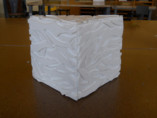
On this project we had to build a corner out of foam core and put a design on it to de-emphasis the corner. I always like to use organic shapes so I was inspired by ocean waves. I tried to capture the organic shape that waves make and how they break.  I wanted the shadows to look like waves in the negative space.

It took me a few tries to cut the shapes just right out of foam core, but eventually I got it the hang of it. Foam core is quite difficult to cut organic shapes with but once you get the hang of how of it then everything goes smoothly.